Widget for Watches
Galaxy Watch widgets had grown inconsistent as more information was added to a small circular display. I refined progress indicators, color, typography, charts, and rounded UI elements to create a more coherent system that made important information easier to recognize at a glance. The work contributed to Samsung’s One UI principles for wearables: clear information, concise presentation, and a unified interface.

Designing for Quick Scanning
Widgets let people view information or take simple actions without opening an app. Because users move between widgets by swiping or turning the bezel, I kept each screen concise and within a single eyespan so information could be scanned without scrolling.

Typography and Layout
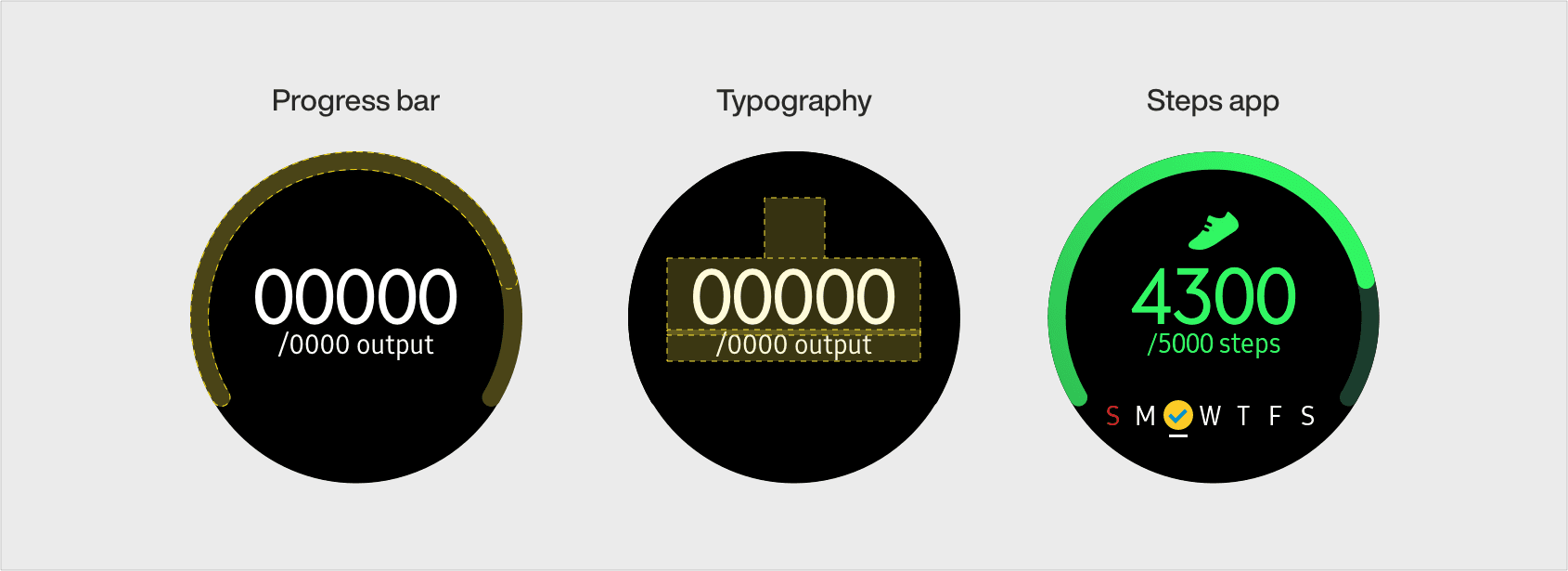
I used visual hierarchy to distinguish current progress from target values. Large type emphasized information that changes, while smaller type handled values users already knew. A bolder circular progress bar made completion status easier to understand during quick glances.
Color System
I organized color by app so people could recognize related functions quickly. Clock experiences shared primary and secondary colors across Alarm, World Clock, Stopwatch, and Timer, while health widgets used a consistent health palette. Heart rate and stress used a distinct orange to separate medical monitoring from general health activity.

World Clock Widget
World Clock helps people compare local time, weather, and daylight saving information across locations. I simplified the display by removing Celsius and Fahrenheit units and refining color, typography, and layout for faster comprehension.

Next projects.
(2016-25©)


